Designing the future faculty office
Last month there was a flurry of articles on the future of the faculty office, spearheaded by this one by Lawrence Biemiller at the Chronicle ("Does the Faculty Office Have a Future?") and followed up by another from Jeff Selingo in the same issue. Unsurprisingly, the articles provoked some vigorous discussion on social media. Whether that was because the ideas in the articles were bad, or because they were different, is hard to tell.
The timing on these articles was inspired, because I had just returned from giving the keynote address at the 2018 Learning Conference at the University of British Columbia Okanagan campus which had a special focus on learning spaces this year. My keynote focused on classrooms, but during the last part of the talk I shifted focus to faculty office spaces, and how we might re-envision these spaces more as learning spaces. This generated an interested from the audience at a level I didn't expect. People really wanted to talk about their offices and how to make them better. After the conference, Peter Newbury, the Centre for Teaching director at UBC Okanagan and the organizer of the conference, even put together a grant program to office money for faculty to update their offices; unfortunately it didn't get off the ground this time, but it got a strong response from faculty.
That part of my talk was based on the results of a year-long project that I was involved with at Steelcase which specifically focused on faculty offices and administrative spaces. It was one of the most interesting thigs I did on sabbatical there. I worked with two of Steelcase Education's designers along with a few others to ask: How might we re-envision the faculty office, and other places where faculty work besides classrooms, given the current and future realities of faculty work? Here's what we did, and what we learned.
How the project went
This project was pre-existing before I showed up last August. When I came on board, the two designers on the project and I sat down, and they quizzed me about faculty life --- What do I do during the day? Where do I like to do it? What's good about the places where I work? What would I change? --- so that they could get from a reliable source what it's actually like to work as a faculty member. A sample size of one isn't great, so early on, I arranged a field trip for us plus two others from Steelcase Education to my home turf, the Grand Valley State University Mathematics Department, so we could do a little ethnographic research.
We visited the department for a full day and interviewed my colleagues in their offices, taking notes on the layout and how the space was being used, and talking with faculty about how they work. We also set aside time to talk with students about how they use faculty offices and what they like and don't like about offices. We also toured some non-office, non-classroom spaces like our break room, the department office, and the Math Center where tutoring takes place to get the broadest spectrum possible of faculty work spaces.
Also included in this research were visits to other local colleges (which I didn't participate in) and a number of design sprints to put together a picture of faculty workspace needs and some potential designs.
What we discovered
I've mentioned before that the workspace at Steelcase defaults to open --- most workspaces in the two buildings on the main Steelcase campus are large, open work areas with different zones for work, augmented by a number of private work spaces of sizes varying from single-person hideaways to 10-person conference rooms. (The post at the link above has pictures.) I personally liked this setup very much; I shared a desk with another Steelcase Education person, but I rarely worked at that desk, preferring instead to roam and find a space that felt right for the moment, whether it was an enclave or a cafe area or an empty classroom. Sometimes I wanted to be around other people and sometimes I didn't, and I basically got to pick where I worked, as long as it wasn't being used already and as long as others knew where I was.
When I reported this during our initial meetings with the project group, it became understood that this was what "faculty" wanted: A work space that defaults to open, but is not a pure "open office" because there would be a plethora of smaller private areas that could be taken when open, or scheduled. This goes to show why it's bad to have an n = 1 in a project like this. Upon floating this idea out on Twitter, and especially after doing our site visit to GVSU, we very quickly discovered that most faculty would hate this. Faculty still want private offices.
No surprise there. What was a little surprising, was why they want private offices. Roughly speaking there were three big reasons, in no particular order:
- To have a private space for consulting with students (especially if it needs privacy, e.g. discussion of grades)
- To have a space to store books (and by extension other stuff like computers, files, etc.)
- To have a place to get away from other people.
Technically speaking, we faculty do not need a personal private office do to the first item; reservable private consultation rooms would be good enough although possibly a little less convenient. Really, the main reasons that are tied closely to actual private offices are the second two.
That third item sounds like being antisocial. In some cases it may be. But there are also good reasons to need private heads-down space: Doing research or reading, or grading, or simple decompression, especially for those of us who are introverts and for whom 50-75 minutes of teaching requires 30-45 minutes of recharging.
As for the second item: It's true, may faculty members (myself included) have specialized items that require locked storage and easy access by the faculty member and nobody else. For example, I have stuff in a filing cabinet in my office at work, and it needs to stay under my control, accessible only by me and whenever I need. Moving it to another location (like a locked cabinet in a common faculty work area) would degrade the usability of that cabinet because I'd have to pull out my confidential files in full view of others. Other faculty may have specialized computing equipment, or books they use frequently that they don't want others to mess with.
In short, we discovered the obvious, that faculty work is different than regular office work and so there are different needs for faculty work spaces. So despite some of the hype in the recent articles on faculty offices, we knew from the beginning that open office plans would be a bad idea, and in fact the private faculty office is not going away as long as we pay real attention to the needs of faculty.
But we also discovered some ways that the current usage of faculty offices tends to impede faculty work, especially when it comes to working with students.
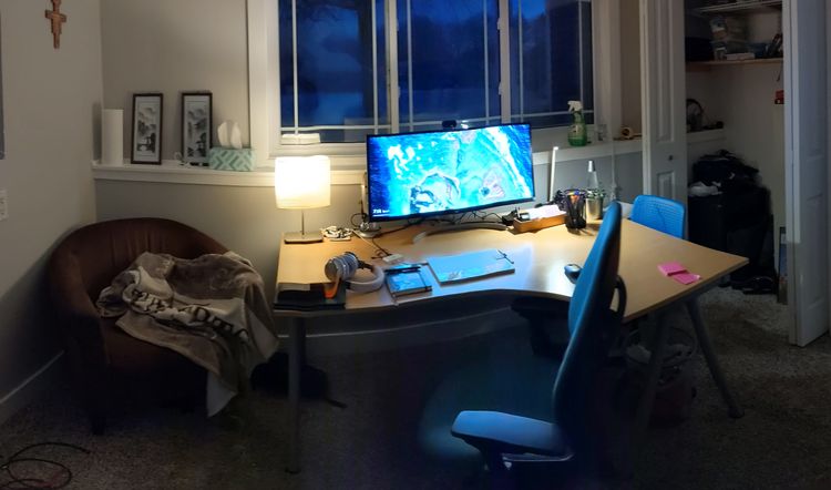
First, personalization of one's office space is generally a good thing. For example, I have a whole wall in my office devoted to my kids' artwork, and it never fails to get positive responses from students. But we found that it's very possible to overdo personalization. It can get to the point where an office is made so personal that it is less like an office than it is a man cave. And then the proxemics of the situation come into play: When an office is so personalized that it is overwhelmingly the personal space of the professor, it becomes very hard psychologically for a student to enter that space.
To see this, imagine you need to speak with your boss or someone else in authority about a question related to work, but to do so you have to go not to their office but to their house. And when you arrive, the boss has you come to their master bathroom, where the meeting will be held. It becomes very uncomfortable to be in that situation, even if there are other people in the house who can vouch for your safety, because you are crossing a line from a public space into someone else's personal space. This triggers a fight-or-flight response in people, very much the same as if you were the only person sitting in a waiting room or on a bus, and then someone else arrives and sits down right next to you, despite the amount of additional seating available. People require more distance, both physical and psychological, between themselves and others in order to be fully comfortable in these kinds of situations.
When we started thinking about the proxemics of faculty offices, it suddenly became clear to me why so many of us faculty have issues with getting students to come to office hours. It's not because students are lazy or unprepared; it's because it takes a tremendous amount of psychological effort to show up at an office --- especially if the space communicates that it belongs to the professor and not to the student --- and physically cross the thhreshhold. The pressure is even greater if you have any sense that you may not belong in the university: First generation student, minority student, or a student who is doing poorly in class.
So perhaps we need to do a better job of communicating to students that our offices are not strictly ours, but rather co-owned by ourselves and students, and therefore students have a claim on those spaces and a right to be there. That communication can and should happen not just with words but with the very design of the office itself.
A second shortcoming of offices that we discovered is that faculty lack the ability or permission to reconfigure them to meet their needs. This makes offices the polar opposite of active learning classrooms, where reconfigurability is essential. We found by talking to faculty that reconfigurability is just as essential in the office. During final exam week, for example, you might want to have a different layout for your office (more space for grading, or more seating for last-second office vists) than you have at the beginning of the semester. In fact, many of the faculty we spoke to do reconfigure their offices differently depending on the need, but they work against both the physical layout of the space and the policies of their university to do so. Faculty do not typically have the freedom to arrange their offices they way they need to.
While I was at Steelcase, not just on this project but in general, I spent a lot of time explaining to the company people that faculty are smart creatives. All of us faculty have creative instincts. You have to have those, in order to do original work in your field and to teach effectively. You cannot understand faculty needs until you factor in our need to be creative. This I think is the source of our desire for academic freedom and shared governance --- we don't want to have our creative outlets stunted or taken away. Even, maybe especially, when it comes to our offices. When you are told that faculty changes to their offices are not to be done whether explicitly through policy or implicitly through design, it touches the same nerve as censorship of your research, and it has a significant though possibly unseen cultural ripple effect.
So the designers on the project came up with the idea of creating offices that came as a "kit of parts" --- basically like a dollhouse, with base components of furniture and storage that could be moved around and reconfigured without the need for a lot of tools or physical effort, and at the discrection of the faculty member. I could not believe the resonance this idea had with some of the faculty I talked with. It was as if the design of the office said, You matter. Your work matters. And your office should fit your work. Many faculty just don't get that message. It's a symptom of a dysfunctional culture, unfortunately; but it can be addressed with basic design.
Aside from offices, we also realized there are some other needs for faculty spaces:
- Adjunct faculty don't really have spaces they can call their own. Sometimes they get shunted into the offices that nobody else wanted, sometimes multiple faculty members at a time, with no windows, bad heating and air conditioning, and so on. For adjuncting faculty, we can learn a lot from the proliferation of nice coworking spaces like The Factory here in Grand Rapids. It's not a private office, but that's not as much of a need for adjuncts. A well-appointed coworking space with access to reservable private consultation rooms might be a far better fit, and be much better for adjuncts in particular than a crappy private office.
- There's also a need for faculty collaboration spaces. The "collaborative by default" layout like I experienced at Steelcase may or may not be best for faculty, but there's no denying that having better spaces for faculty collaboration is a need, whether it's committee meetings or shared research space or just space to hang out and socialize. In my department, for example, there are precisely two conference rooms for 30 tenure-track faculty and around 10 committees, and the only social space we have is a 100 square foot copy room.
What we did
Through this project, we learned:
- The private faculty office will be sticking around for a long time. There's no changing that, despite what you read in various articles.
- But faculty offices can and should be seen more as shared spaces, "owned" by faculty but open to students and thought of as another form of learning space.
- Faculty need to truly "own" those spaces by having autonomy to set them up, and reset them, at will according to their needs.
- Faculty also need to have real options for doing work outside their offices, for example in "third space" areas, spaces for collaborative work with each other (no students allowed!), and spaces for collaboration that isn't work.
- Finally, the whole concept of "faculty" is much broader than it used to be, and faculty work spaces should embrace the full diversity of what faculty experience.
The design group on this project took all of this ethnographic data, and through a series of design sprints came up with a collection of prototypes for many different forms of faculty spaces. They are, like most Steelcase designs, simply beautiful and make me want to have one of my own right now. These designs were put into a booklet that you can download for free at this link:
https://www.steelcase.com/spaces-inspiration/active-learning-spaces-faculty/
(You do have to give some contact information before you can download the booklet.) There is also a whitepaper by Jeff Selingo (author of one of those Chronicle pieces) on the future of the faculty office that you can download.
Here are just a couple of the designs that the designers came up with.
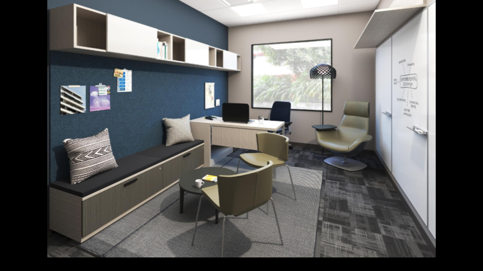
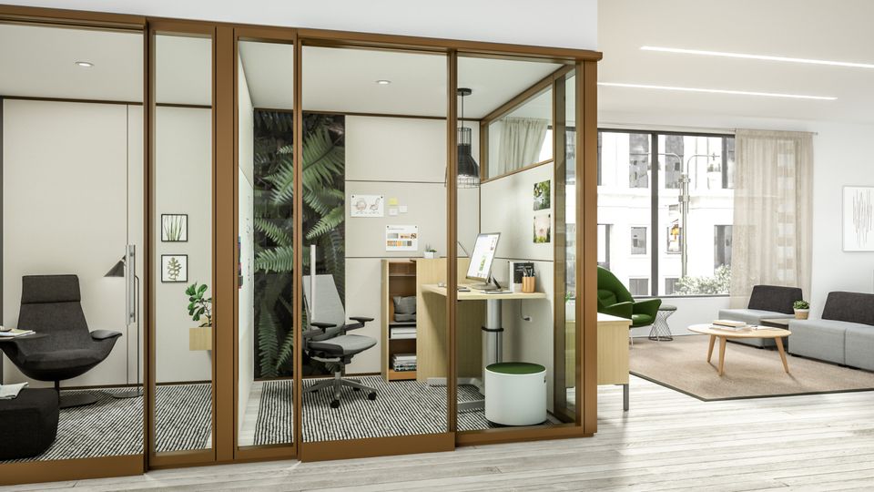
This office, which is on a 10' x 12' footprint, has three distinct zones: A desk for computer and grading work, a chair with lighting for deep focus and reading, and a collaborative front area for student work. Notice you could have at least 5-6 students sitting down in this area on the bench storage; and especially note the full wall of whiteboards. (That's another thing we found: Almost all faculty want lots more whiteboard space in their offices than they currently have.) If you're asking Where will my books go? --- really, there's plenty of shelf space here for the essentials. Remember that making your office into a mini-library may end up being counterproductive if we are thinking about students first. Ask yourself: Is it possible, just maybe, that I don't need to have all the books that I have, in my office right now?
Here's another:
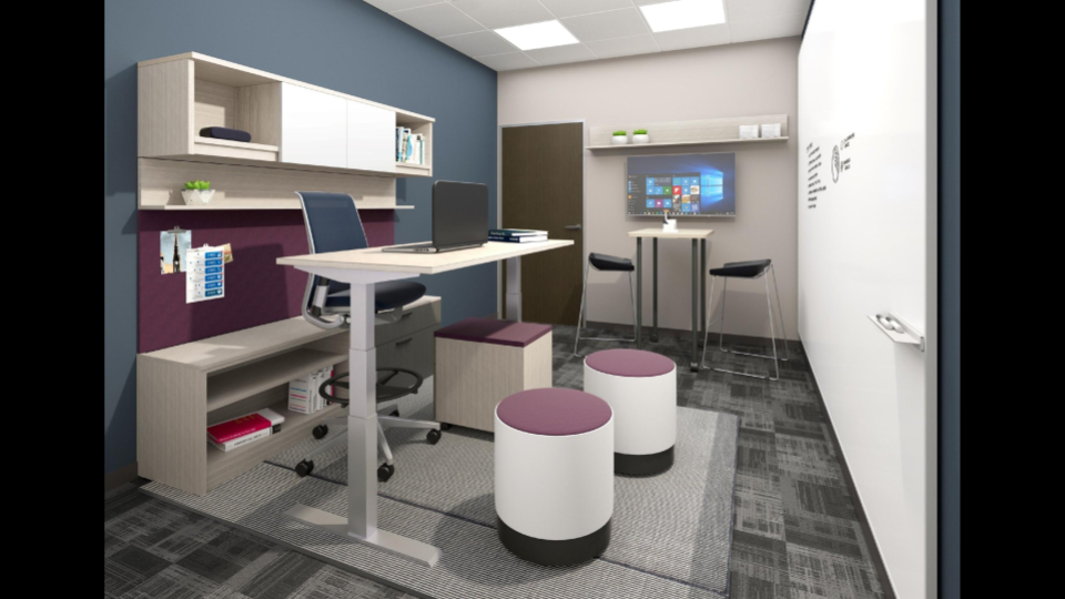
This one is not as home-like as the first one, but what's interesting about it is how much variety there is. There's a workspace with a height-adjustable desk; a ton of whiteboard space; room for 2-3 students to be working in front of the desk at the whiteboard while you're at the desk; and, especially, a little digital work area next to the door where you can plug in with a student to a large monitor. Another variation in the idea book at the link has a larger, 5-person monitor area.
What these and the other designs all have in common, is that they communicate to the students when they look at the space that this space also belongs to them. These offices are learning spaces, not just the personal domain of a faculty member. That's not only appropriate, it's the direction that faculty offices need to go in order to be relevant for students as we move forward. My hope is that the ideas from this project will take shape over the next couple of years as new academic spaces are built in various places. Once we see the office step into the future, it will be hard to go back.
