The Five Question Summary revisited

Some time ago, I reached a point where my patience with student evaluations of teaching (SETs) ran out, and I decided to create my own evaluation form rather than try to make something useful out of what we use at my university. The result was something I called the Five Question Summary: a simple evaluation that consists of just five questions, developed using the science of motivation, and which can be administered in less than 5 minutes and which was designed to be given multiple times through a semester.
More recently, I've been looking for projects to hone my emerging data science skills, and I decided to do a reboot of the Five Question Summary. In this article, I'll explain what the Five Question Summary is and why I think it's better than standard SETs, and then I'll show you a workflow I now use that involves Google Forms and an R script to generate statistics and visualizations from the results of a Five Question Summary that you can use with your own students.
What's wrong with traditional SETs?
The traditional form of a student evaluation of teaching (SET) is a survey given at the end of the semester, which asks students anywhere from 10 to 30 questions covering different aspects of a course, including the instructor's teaching style, course content, organization, workload, learning outcomes, and overall satisfaction. Most SETs also include open-ended questions for additional feedback or comments. The forms at my university have 31 questions, not including the open-ended ones. Here's a sample:
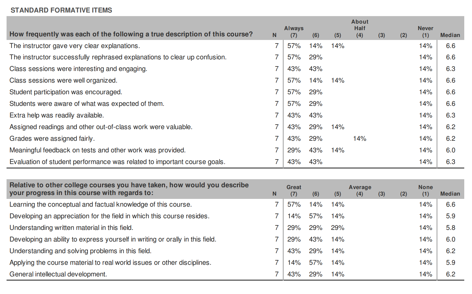
While it's a good thing to have a data-driven approach to thinking about teaching, especially if the data come from students, traditional SETs miss the mark in a number of critical ways. This paper by Rebecca Kreitzer and Jennie Sweet‑Cushman highlights two "problematic and consistent findings" about SETs:
- Measurement bias: The data from SETs are systematically influenced by factors other than the quality of teaching. That is, the data do not measure what they claim to measure. For example, studies find that classes with lighter workloads and higher grade distributions get higher evaluations; quantitative courses typically get lower evaluations than non-quantitative ones; and in at least one study, the authors found that bringing cookies to class can influence course evaluations.
- Equity bias: Most studies on SETs find that an instructor's gender, ethnicity, accent, sexual orientation, or disability status can have a significant impact on their course evaluations, usually negative if the instructor differs from their students in one or more of those areas. In particular, men are more likely to be perceived on SETs as "adept, brilliant, or organized instructors" than women.
That's bad enough, but it gets worse. In most cases, the instructor doesn't see the SET responses until well after the course is over. This makes it impossible to use the responses to improve the class that is being evaluated. The best one can hope for is to "pay it forward" and improve future classes, which may or may not bear any resemblance to the class receiving the evaluation. But for the students who are filling out the forms, they have no incentive to give suggestions for improvement, other than sheer altruism, because they are out the door.
It would be far better if SETs could be given multiple times during a semester, so the responses could be used to make improvements on the fly. You could do this with traditional SETs by giving out copies of the form to students at intervals during the course, and collecting data unofficially. But the length and complexity of the evaluation form mitigates against this. Look back at the example from earlier: 31 questions not counting open-ended ones. Who has time and energy either to fill this out or to analyze the data every 3-4 weeks?
And this is all assuming that the feedback on SETs is useful feedback in the first place. It likely is not, given what we know about measurement and equity biases. Even if student responses are unbiased, it's a stretch to even call these "evaluations". Typically what we mean by that term is a careful analysis of a process or program, performed by a trained evaluator and in reference to established professional standards. Whatever one might say about SETs, they do not fit this description. That's why I've taken to referring to SET responses as "student perception data" rather than "evaluations".
So to recap: Traditional SETs don't measure what they claim to measure; they discriminate against people who aren't white, male, English-speaking, and straight; in a best-case scenario they provide feedback that cannot be acted upon until it's too late to do any good; they're too long and complicated to be used in any other way; and they don't really even qualify as actual evaluations because they are being written by untrained students with presumably zero knowledge of professional quality standards for teaching. Other than that, they're just fine.
Enter the Five Question Summary
I've decided that it's just no good to try to "fix" SETs. They are in dire need of a replacement; the only question is what to replace them with. Getting rid of student feedback altogether would be overkill, though – we just want to make student perceptions useful and actionable, to align with good teaching practice and, especially, lead to better teaching for the students in the class now, and not just for some future population.
So I invented a minimalist student feedback form, called the Five Question Summary because it is only five questions long. Those questions ask students simply to rate their level of agreement (1 = Strongly disagree to 5 = Strongly agree) on the following statements:
- So far in this course, I've been challenged intellectually by the content and activities in the course.
- So far in this course, I've had plenty of support from the professor, my classmates, and the course tools as I done work for the class.
- So far in this course, I am closer to mastering the course concepts now than I was at the beginning of the semester.
- So far in this course, I have made progress in learning because of my own efforts and choices.
- So far in this course, I've felt I was part of a community of learners.
The items correspond to two major areas that impact a student's learning experience. One area, represented in items 1 and 2, is the balance between challenge and support; ideally we want a learning environment where students are pushed and challenged, while at the same time surrounded by support as they work. The other area is motivation, particularly intrinsic motivation. Self-determination theory states that motivation derives from the confluence of three experiences: competence (the knowledge that you are gaining mastery over a task), autonomy (the belief that your improvements are the results of your efforts, not something external or having "success" handed to you without effort), and relatedness (the feeling that you belong to, or are connected with others as you learn). This is where items 3-5 come from.
I first wrote about the Five Question Summary in this article and I have used it many times since then. Among the things I like about this approach is that it focuses solely on the core experiences common to good teaching and learning environments, with nothing extraneous or irrelevant or duplicated. It does not focus on me or my personal characteristics; it focuses on the student and their learning experiences. And it's short, which means it's easy to give multiple times in a semester and use the data in a truly helpful formative way. Indeed the wording of the questions ("So far...") makes multiple iterations of the form an expectation.
Collecting the data
I'm convinced that these five items, along with responses from a pair of open-ended questions that accompany them, give me all the information I need to triangulate how I'm doing as a teacher and what I can do to improve, in the moment and not once the course is over.
What follows is a workflow that I am currently using to collect, process, and analyze the data.
The five questions are administered using a Google Form. Here is a template for that form that you can copy and reuse. It starts with some instructions, fields for the student's email and name, and their section number of my class. Obviously change the class and section numbers to suit you, or just delete them if you don't care. If you want these to be anonymous, delete the question about names and click Settings, then Responses, and then next to "Collect email addresses" change the dropdown menu item to "Do not collect".
After those questions are the five main items and two open-ended questions. Feel free to modify any of these (although some of the R script later on may not work if you change things too radically). I advise against adding things to this form because the idea is to make this simple and minimal, something that a student could do in significantly less than 5 minutes.
At some point, go to the Responses tab and click the green icon that says "Link to Sheets". This will send all past and future responses to a Google Spreadsheet. You'll need that spreadsheet to do the visualizations below.
Using the data
Once students fill the form out -- which they can do outside of class, or as an entry or exit ticket, etc. -- you will have a spreadsheet of data.
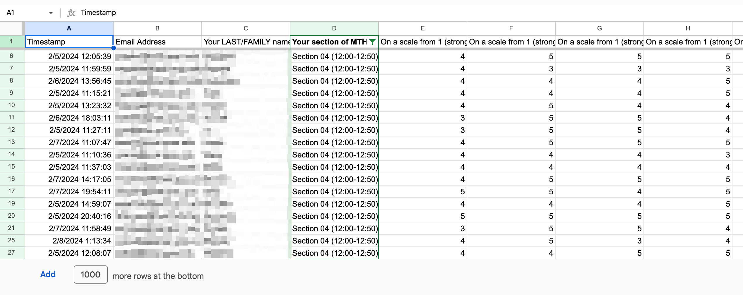
In the spreadsheet, columns "A" through "D" will have demographic data in it: A timestamp, email address, last name, and section number in that order assuming you leave those in and don't add anything else. It can be helpful to have this information, particularly if a student's responses warrant some kind of follow-up.
But mostly, what we're interested in are columns "E" through "I". These are the numerical agree/disagree responses to the five main items. Specifically we'd like to know how many times each response occurred on each item, and what the distribution of responses was like on each item as well as the overall summary stats on each item. These data can be useful in and of themselves, and they will allow us to make useful visualizations of the data.
When I first built the Five Question Summary form, I did all the analysis and visualization using Python, particularly the pandas ecosystem. At the time, that was the only language I knew. But over the last couple of years I have been learning R, which despite some annoying quirks is really the best tool I know for running data analysis and visualizations.
I decided to rewrite the Python script from the earlier article in R just as an exercise to learn R, and I ended up (in my view) improving on it in a number of ways, so I'm sharing the code here. I'll go through the process step by step, but you can click here for the entire script. And in what follows I am using actual student responses from my current (Winter 2024) sections of Discrete Structures for Computer Science.
First we're going to load some relevant R packages and then change the names of the spreadsheet columns to something simpler:
# Libraries
library(dplyr)
library(tidyverse)
library(ggplot2)
# Load data
colnames <- c("time", "email", "name", "section",
"challenge", "support",
"competence", "autonomy", "relatedness",
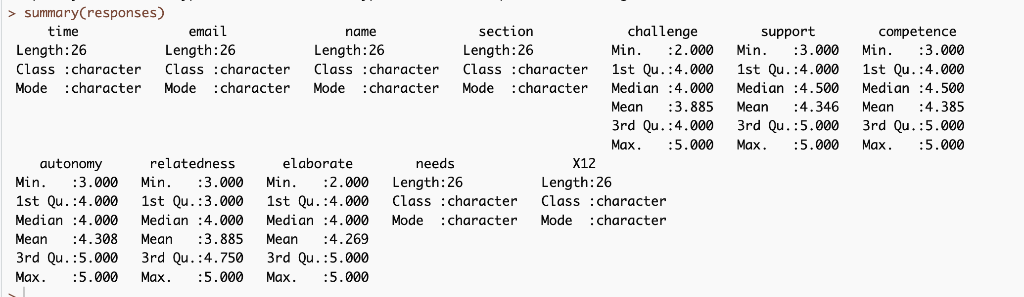
"elaborate", "needs")Next we read in the data. This assumes that you've exported the Google Spreadsheet to a comma separated value (CSV) file and have placed it in the same directory as the script. I'm naming the CSV sample_5qs.csv. Once we run this line, it's translated into a data frame called responses.
responses <- read_csv("sample_5qs,csv",
                      skip = 1,
                      col_names = colnames)
To get the summary stats on the form responses, just enter summary(responses):
This is nice, but a visual picture of the distributions on the five main items would be more useful. The following code produces two sets of boxplots, one that has the distributions for the "challenge" and "support" items, and another with the three motivation items. (Putting all five in the same plot makes it too wide for my taste so I separated them.)
# Combined boxplots

## Challenge and support variables
y_range <- range(c(responses$challenge, responses$support))
par(mfrow = c(1,2))
boxplot(responses$challenge, main = "Challenge",
        col = "lightblue", border = "black", ylim = y_range)
boxplot(responses$support, main = "Support",
        col = "lightgreen", border = "black", ylim = y_range)
par(mfrow = c(1,1))

## Self Determination variables
y_range <- range(c(responses$competence, responses$autonomy, responses$relatedness))
par(mfrow = c(1,3))
boxplot(responses$competence, main = "Competence",
        col = "lightblue", border = "black", ylim = y_range)
boxplot(responses$autonomy, main = "Autonomy",
        col = "lightgreen", border = "black", ylim = y_range)
boxplot(responses$relatedness, main = "Relatedness",
        col = "lightcoral", border = "black", ylim = y_range)
par(mfrow = c(1,1))
Here's the second set of boxplots it creates (the first pair is similar):
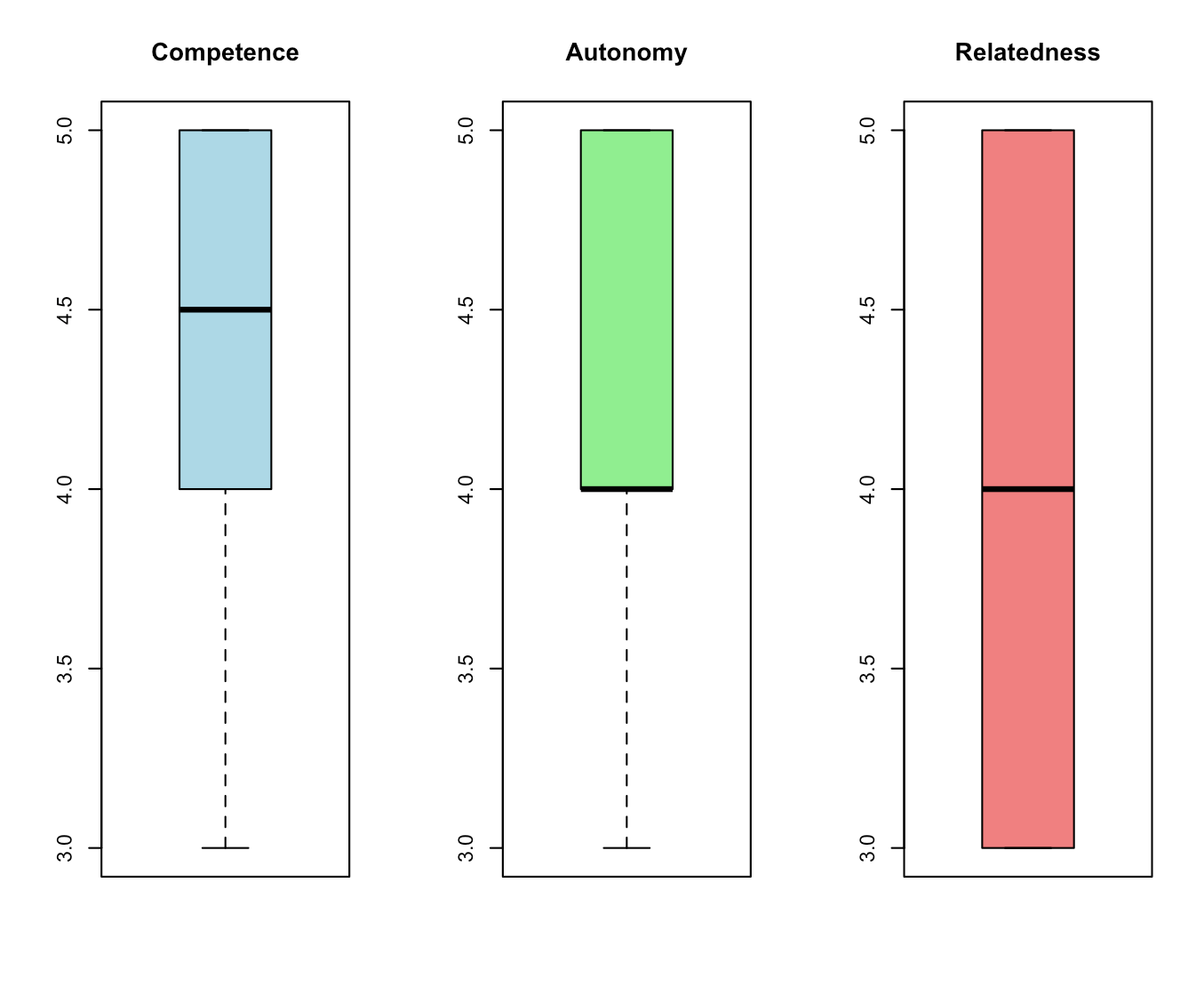
I don't think these particular boxplots are very useful, because almost all the responses are 4's and 5's. But if there was more variation, the boxplots would detect and display it.
A more interesting and fruitful use of the data, in my view, is plotting the results of one of the five main items against one of the others. The combination of two variables can be revealing. In my earlier post from 2019, I applied this idea to "challenge" and "support" to come up with this 2x2 matrix of experiences:
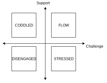
You might also explore other combinations, like "competence" vs. "autonomy". A student giving a high (4 or 5) response to "competence" but a low (1 or 2) response to "autonomy", for example, feels like they are learning and growing, but they don't feel much personal agency in the process. As an instructor, this might signal that the student needs more individual practice, or perhaps has grown too reliant on group work or tutors.
In R, it's not terribly hard to create a kind of two-dimensional histogram of item responses plotted on a 2D axis like the above. What we can do is:
- Pick the two variables we want to plot (like "challenge" and "support") and tally up the frequencies of each pair of responses, like (Challenge = 4, Support = 5).
- Set up an xy-axes for the two variables and plot each pair of responses like a point in the plane.
- Then, to indicate the frequency of each response pair, print the frequency on top of the point and make the point's size proportional to the frequency, creating a basic "heat map".
The following code does all of that, for the "challenge" and "support" variables:
## Start with a basic scatterplot of support vs challenge
## Condense responses to a single data frame with unique rows plus frequencies
chall_support <- responses[, c(5,6)] |>
  group_by_all() |>
  summarise(freq = n())

## Scatterplot of responses with frequencies labelled
chall_support |> ggplot(aes(challenge, support)) +
  geom_hline(yintercept = 3, linetype = "dashed", color="black", size=0.2) +
  geom_vline(xintercept = 3, linetype = "dashed", color="black", size=0.2) +
  geom_point(color = "lightblue", size = chall_support$freq, alpha = 1) +
  geom_text(aes(label = sprintf("%d", freq)), size = 5) +
  labs(title = "Support vs Challenge", x = "Challenge", y = "Support") +
  scale_x_continuous(limits = c(1,5)) +
  scale_y_continuous(limits = c(1,5)) +
  coord_cartesian(clip = "off") +
  theme(plot.margin = margin(1,1,1,1,"cm"))
It produces this plot:
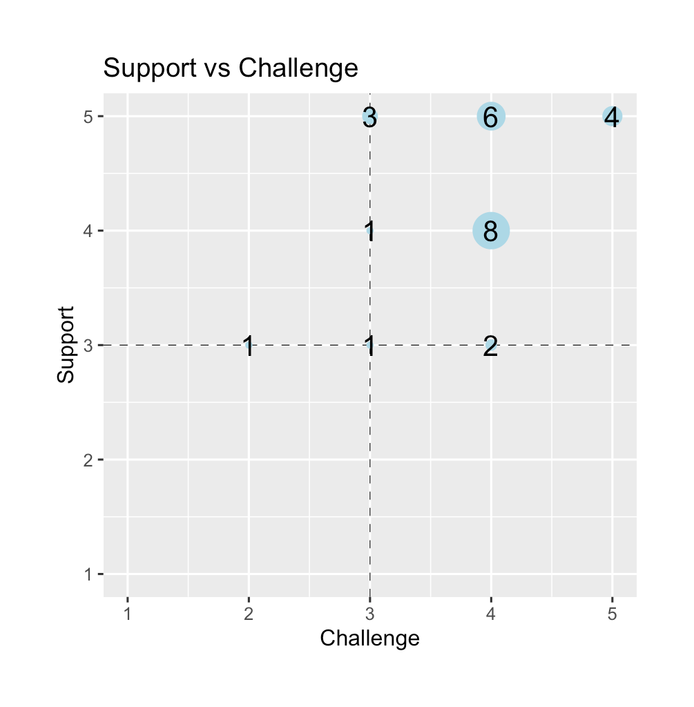
(To clarify, "Support" is on the y-axis and "Challenge" is on the x-axis.) What this tells me, at a glance, is that most of my students are in the "happy zone" in quadrant 1 where they are both challenged and supported. And nobody disagreed that they are being supported. But, I do have one outlier whose coordinates are (2,3) – not feeling challenged, and is "meh" on support. Might be worth an email to see if I can help them.
Here's a similar plot but with autonomy vs. relatedness:
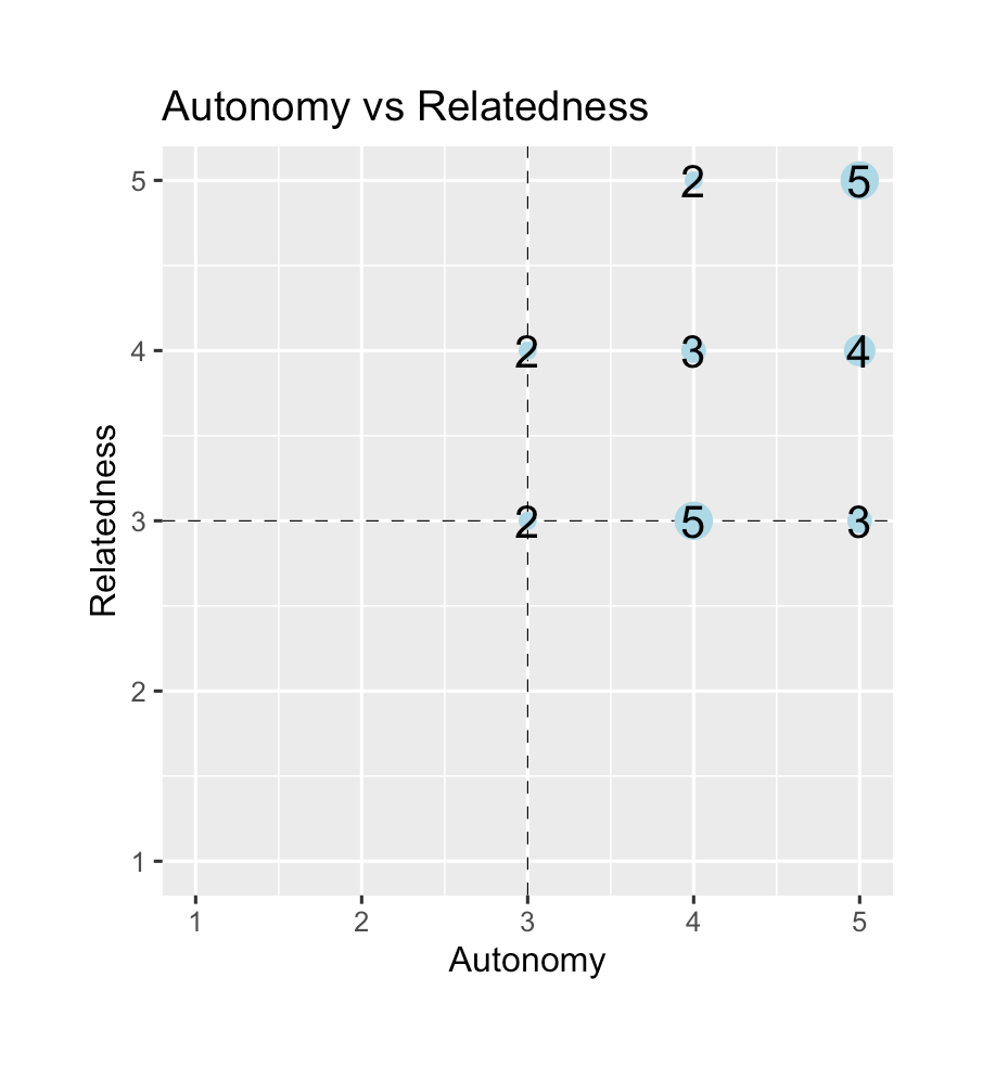
To swap out the variables, just change the numbers being put into the code and change the column names:
sdt_paired <- responses[, c(8,9)] |>
  group_by_all() |>
  summarise(freq = n())

sdt_paired |> ggplot(aes(autonomy, relatedness)) +
  geom_hline(yintercept = 3, linetype = "dashed", color="black", size=0.2) +
  geom_vline(xintercept = 3, linetype = "dashed", color="black", size=0.2) +
  geom_point(color = "lightblue", size = auto_related$freq, alpha = 1) +
  geom_text(aes(label = sprintf("%d", freq)), size = 5) +
  labs(title = "Autonomy vs Relatedness", x = "Autonomy", y = "Relatedness") +
  scale_x_continuous(limits = c(1,5)) +
  scale_y_continuous(limits = c(1,5)) +
  coord_cartesian(clip = "off") +
  theme(plot.margin = margin(1,1,1,1,"cm"))
That seems like a lot of students on the fence about relatedness, although their sense of autonomy looks like it's doing fine. So maybe I should look into how groups are operating during class.
The Five Question Summary becomes even more useful when you give it more than once and then track the responses over time. The data plotted above were collected in week 5 of a 15-week semester. If you also collected data in weeks 8 (= midterm season) and 12 (heading into the final exam) you might detect changes in student perceptions of these critical elements of your class. For example, if I do an intervention with my students who, in week 5, felt somewhat lukewarm about the support they were getting, and if I got suggestions from them about how to make this better and acted on those suggestions, another round of the Five Question Summary would show me if those measures are having an effect. This is way more useful than a single course evaluation given after all possibility of improving that course has expired. (Although you could even given the Five Question Summary again as part of a final exam or culminating experierence to get an "ending state" of the class.)
In conclusion
In fairness to traditional SETs, getting trustworthy, actionable data on teaching and learning is hard. There are just so many nuances and ambiguities involved because of the human nature of education that a survey form is going to be a blunt instrument every time. I think the Five Question Summary is not the answer to all of our problems on assessing teaching and learning. But it's a step in the right direction: Something simple, short, and focused on the core facets of teaching and learning that can be used to actually gather useable data rather than just give a glorified Yelp! review. If the goal is true improvement, then this might be a possible ticket.