Learning to learn data science, part 1: Beginner’s mind

This is a reprint from a series of posts I'm currently doing on data science in teaching, over at Medium.
Beginner’s mind is the concept of approaching life with fresh eyes and a clean slate and no pretension of expertise. When it comes to learning data science, that’s easy for me, because I had no actual expertise to begin with when I started learning the subject in earnest this past summer.
Although I have a Ph.D. in mathematics and 25 years' experience as a professor, including some background in Python, when I decided to get serious about learning R and data science (and learning analytics in particular) and attended the LASER Institute at NC State this year, I was starting from zero. The LASER Institute was a great way to begin, and I’ve been reading some of the classics on data science. But after some time doing formal training, I realized what I really needed was to get my hands on a real project of my own design.
This is the first in a series of articles which are about that project, but which are also about how I learned how to learn data science. As I would get stuck, I’d go to Twitter, blogs, and websites for ideas. The blogosphere (is that still a word?) and the #RStats community have been super helpful. But I noticed that mostly these were written by experts, and there was a dearth of noobs, like me, out there writing about their processes as they try, fail, and (sometimes) succeed to learn this area. So I decided to write this series. I normally write about higher education and alternative grading, and I’ve never blogged about coding. But I’m told that this might be helpful, if nothing else to show what it looks like for a seasoned learner to learn something new.
I should warn you, if you are experienced with R or data science, some of this could be painful to read. But remember: beginner’s mind.
First, some boring academic background
This project takes place in an upper-level discrete math course that I teach for computer science majors. I use an alternative grading method known as specifications grading. Briefly, in “specs grading”:
- None of the student work has numerical point values.
- Instead, each item of work is graded essentially “Pass/Fail” based on whether it meets quality standards (“specifications”) that are set up.
- Students get to revise and resubmit basically anything that doesn’t meet the standard, over and over again, until it does.
- Course grades are based on the number of times different kinds of assessments have met the standard.
If you want to know more, here’s the syllabus and here’s the document with the specifications.
The core content knowledge is spelled out in 20 Content Skill Standards (found at the back of the syllabus linked above, if you want to see them). Part of the students’ job is to master these skills. Doing so is called “meeting” the standards. Students “meet” each standard by providing two successful demonstrations of skill on the standard. A demonstration of skill could be successful work on a test question, or an oral exam, or a video. Meeting a standard requires two such demonstrations (because the difference between one demonstration and two is the difference between coincidence and true skill).
There’s more to it than this, so (as I tell students) read the syllabus to learn more. But the point for now, is there are these 20 standards that each require two pieces of evidence of mastery in order to be met.
The problem
Each standard has four possible statuses per student at any point in the semester:
- The student has met the standard via two successful demonstrations of skill;
- The student has given one successful demonstration of skill but not two, at least not yet;
- The student has attempted a demonstration of skill but none are successful yet; or
- The student has not yet attempted a demonstration of skill.
These statuses are all recorded on Blackboard, our course management system. It looks like this in the gradebook:
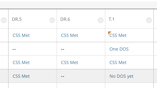
(Conveniently for a class of CS majors, the abbreviations for Content Skill Standard and demonstration of skill are CSS and DOS.) “CSS Met” and “One DOS” indicate two or one successful demonstrations of skill, respectively. “No DOS Yet” means there has been at least one attempt, but none successful yet; the dashes mean there’s no attempt yet.
Got it? Awesome. Here’s the problem:
Create a series of charts, one for each standard, that shows the percentage of students’ current statuses on that standard.
This is what I had in my mind:
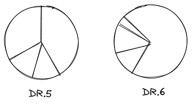
And so on for all 20 standards, with the percentages colored in according to status. (Yeah, I know: pie charts are bad. I’ll get to that.)
This would serve as a dashboard for making pedagogical decisions. If 75% of my students, for example, either had attempted standard DR.5, but none were successful, then I need to provide more practice and instruction on that topic. But if 100% have met that standard, then I can quit asking about it.
Reading is fundamental
Now that I (think) I knew what I wanted, it was time to wrangle the data, which as they tell you when you are learning data science is the “fun” part.
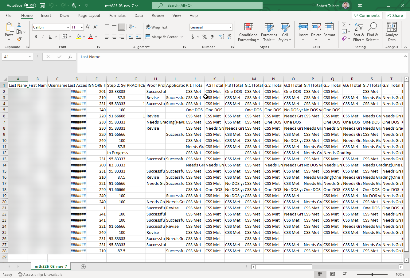
Blackboard (like all LMS’s) lets you export the gradebook as a CSV. Here’s a glimpse of the raw export in Excel. You can see the content standards starting in column J.
With data in hand, we fire up RStudio and start loading stuff:
# Libraries
library(tidyverse)
library(janitor)
library(ggplot2)
library(readr)

# Load in spreadsheets from Blackboard
mth325_03 <- read_csv("mth325-03-nov-7.csv")
mth325_04 <- read_csv("mth325-04-nov-7.csv")
If the order of the libraries seems weird, it’s because honestly, some of these I loaded “just in case”, and I’m not totally sure I used them all. 😅
There are two CSV’s here because I taught two sections of the course (sections 03 and 04). And as you can see from the CSV screenshot, there’s a bunch of cleaning tasks to take care of.
First: Blackboard has no option to select the columns you want exported unless you want to export only a single column (which, why?). If you want more than one column you must take them all. So, I needed to pull out the columns I care about:
# Extract just the columns with the standards in them
sec03 <- mth325_03 |>  select(`P.1 [Total Pts: 2 CSS] |2886065`:`T.3 [Total Pts: 2 CSS] |2886250`)
sec04 <- mth325_04 |>  select(`P.1 [Total Pts: 2 CSS] |2930675`: `T.3 [Total Pts: 2 CSS] |2975145`)
This is the correct code that I eventually came up with. But first, I spent half an hour mistakenly using filter instead of select and then cussing out RStudio for giving me errors. But filter, as you probably know, gives you the rows of a data frame that satisfy some kind of condition, whereas selectgives columns, and it turns out that rows and columns are different.
Here’s where my first big lesson occurred. I made this mistake because I came to this problem overconfident. I had gone through a week of LASER Institute training and having read the first half of R for Data Science and just assumed that on that basis, I knew what I was doing when it came to loading data. Eventually I will get to this point. But I am not there yet. That seems like a good mantra for beginners at anything.
Then for 30 more minutes, I got stuck trying to use selectin a Pythonic sort of way, by referencing the column indices. This sort of thing can be done, but it’s not the simple way. It finally dawned on me that I could just give the names of the columns like you see above and in R, it works. Old habits in Python, which I’ve been using for 10+ years, are hard to break.
Anyway, I now had two data frames with my stuff in them.
What’s in a name?
But those column names are gross, right? Blackboard, in its wisdom, isn’t satisfied when you give a gradebook column a simple descriptive name. It appends a string that indicates how many points the item is worth (which is annoying because I don’t use points), and a serial number that uniquely identifies each column of every gradebook, apparently in existence. (That serial number would cause more problems later.)
So, second: Let’s get the names into shape. I thought it would be a good idea to create a variable that holds all the names of the standards:
css_names <- factor(c('p1', 'p2', 'p3',
	'g1', 'g2', 'g3', 'g4', 'g5', 'g6', 'g7', 'g8',
    'dr1', 'dr2', 'dr3', 'dr4', 'dr5', 'dr6',
    't1', 't2', 't3'),
    levels = c('p1', 'p2', 'p3',
    	'g1', 'g2', 'g3', 'g4', 'g5', 'g6', 'g7', 'g8',
        'dr1', 'dr2', 'dr3', 'dr4', 'dr5', 'dr6',
        't1', 't2', 't3'))
Originally, this was just the vector of strings c('p1', ..., 't3') that you see above. I only changed this to factors later on, for reasons I’ll explain in a later part of this series. This turned out to be a useful thing to do.
Having defined the names, I now wanted to replace those awful column names with these. Here, I got stuck again. I didn’t really know how to do this, so I Googled. But it turns out there is more than one way to rename columns in a data frame.
Having more than one way to do things is a feature of R, and frankly it’s a fact of life about most things we do. But it’s also a pitfall for noobs who lack the judgment to pick the best way to do something.
I spent another half hour studying tutorials like this one that tell you to use the rename function in dplyr, which I was not able to do successfully. It was only after giving up, frustrated, that I stumbled upon:
colnames(sec03) <- css_names
colnames(sec04) <- css_names
…which not only does what I want, it’s also elegant.
Another lesson: There is usually more than one way to do anything that is interesting. Unless you are extraordinarily lucky, you’ll run into this situation and pick a way that isn’t best for your situation at some point. This is not a defect in your thinking, it’s part of the learning process. In fact, merely realizing that you have a less-than-optimal solution is a pretty sophisticated cognitive act. In the moment, the only thing you can do is pick what seems best, and if it isn’t best, you try to understand why and then find a better way.
Not so much a lesson as a side note: It’s easy for experts in a subject to forget just how frustrating it can be for a new person to fail at something simple. This was one of those moments for me. How can I say I am learning data science when I can’t even rename columns of a data frame? I nearly gave this whole thing up a few times. It takes work to get past that.
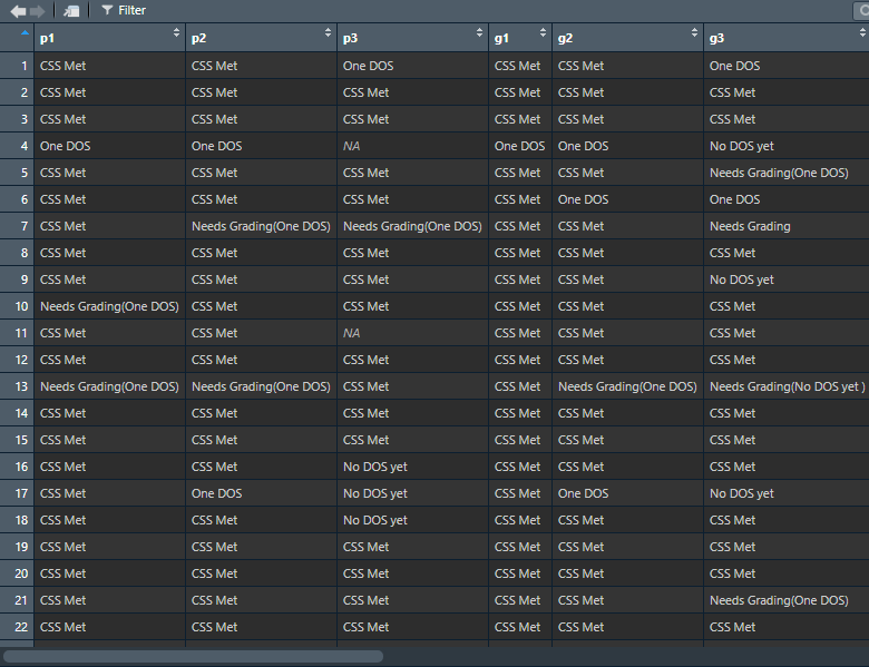
So, here’s what things looked like so far:
Since both sections’ gradebooks had the same basic structure, I wanted to stack them into one big gradebook. At first I froze, thinking I needed to go relearn everything I’d forgotten about joins. After Googling (stop laughing at me!) I realized that that’s not what joins are for, and simply stacking one dataframe on top of another with the same column structure is easy:
standards <- rbind(sec03, sec04)So now I have my gradebook represented in R as the dataframe standards. (It looks like the picture above, only longer.)
What I learned so far, and what’s next
By this point I’d actually learned, in a deep sense, a lot of basic data science just by grappling with importing and cleaning real data — probably more than what I learned from books, although books are really useful. Apart from the technical stuff above, here’s what I’d learned so far:
- Mentioned above: Don’t be cocky going into a problem. Take your time and check anything you are not 100% sure about (and some of the things that you are).
- Also mentioned above: There is more than one way to do anything interesting. And this is both a feature to enjoy and a bug to watch out for.
- Frustration is inevitable when learning something interesting. This is a sign of learning, not a signal that you are stupid or out of your lane.
- When the frustration kicks in, it helps to step back and breathe: Remind yourself that you have done hard things before, you have just as much of a right to be learning data science or whatever as anybody else, and one day you might fail at something, and the next day succeed. So, remind yourself why you’re doing this, and keep at it.
There’s a lot more to be done to eventually get to the visual grade dashboard I wanted. (Spoiler: I eventually did finish this project!) But this post is long enough, so I’ll leave this for the sequel(s). Briefly:
- I needed to fix the entries in the data frame, as there were some unexpected strings showing up.
- I needed to figure out how stacked bar charts work in ggplot, because pie charts are bad and stacked bar charts are what I actually wanted.
- It turns out that my gradebook was nowhere near properly set up to produce the visuals I wanted, so I had to venture into pivoting — and finally start really understanding what tidy data is.
Next time, you’ll see what transpired when I attacked the first bullet point. Hint: My eyesight is apparently not that great.