Agile student feedback through the Five-Question Summary
Probably the most important ingredient to teaching excellence is frequent communication with students. Most of the mistakes I've ever made as a teacher — and over 25 years, there have been a lot of those — have boiled down to mistakes in communication in the end. We can't read minds, and our reading of body language is usually flawed too. So to really know what students are thinking, what they know and don't know, and how they're doing, we have to maintain clear lines of back-and-forth communication at all times — for example giving frequent informal course evaluations during the semester and surveying students on a regular basis— otherwise our teaching is just guesswork.
At my last Trimesterly Review I set a goal to improve the student experience in my courses, specifically the Precalculus course I'm teaching online this summer. I've taught Calculus online before, and in a hybrid format back in Fall 2018, and the classes were OK... but just OK. Each time, I've come away thinking that something was missing from the student experience. I couldn't quite put my finger on it — which told me that I wasn't communicating well enough with my students and not collecting the right amounts or right kinds of data from them. All I know is that I got decent course evaluations, but there were signs that a lot of improvements could be made. So this summer I am really focusing on finding and making those improvements. To find them, I realized I needed some metrics for gauging how the students are doing.
In the past, I've experimented with two kinds of approaches to getting information from students through mid-semester evaluations:
- The minimalist approach. I've asked students to fill out a Start/Stop/Continue form — just three questions — and looked at the verbal data. I've even done a two-question version where I ask students "What do you love about this course?" and "What would you change about this course?" The "pro" of this approach is that it's simple and free-form and generates a lot of qualitative data. The "con" is that it's all qualitative and subject to my interpretation; there aren't any quantitative items there that I can track.
- The maximalist approach. This involves taking a significant subset of the end-of-semester course evaluation questions and putting them in a form for a mid-semester evaluation. The "pro" here is that it generates a lot of numerical data that I can look at, and it trains the students on the course evaluation questions so at the end of the semester the questions are familiar. The "con" is that it's often 10+ questions long — too much data to slice effectively and students are put off from responding to such a long survey.
I realized that I needed to make up my own metric that is somewhere in between these two approaches: Quantitative in nature but grounded in good qualitative ideas and sound theory; short and sweet enough to be something students want to finish but not so short that the data have no explanatory power; and something that I could give students on a very frequent (weekly) basis and which would inform my goals for teaching.
What I have come up with is something I call the Five Question Summary. It's just the following five questions, which students rate on a scale from 1 (strongly disagree) to 5 (strongly agree):
I was challenged intellectually by the content and activities this week.
I had plenty of support from the professor, my classmates, and the course tools as I worked this week.
I am closer to mastering the ideas of the course now than I was at the beginning of the week.
I made progress in learning this week because of my own efforts and choices.
I felt I was part of a community of learners this week.
The first two questions address the balance between challenge and support. This balance is at the heart of my teaching philosophy and I want to know on a regular basis how students are experiencing this balance (or lack thereof). As I was thinking up these questions, it occurred to me that you can put these two variables into a 2x2 matrix to create four quadrants, each of which describes a student's potential situation in the course. Students in quadrant I (high challenge/high support) are in something like a state of flow, which is what I want. Students in quadrant II (high support/no challenge) are being coddled (not a fan of that term but I couldn't come up with anything better). In quadrant III (low support/low challenge) students are disengaged. And if you're in quadrant IV (high challenge/low support) you are stressed (originally I described it as "screwed").
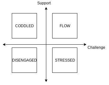
What I hope for week after week are a majority of the students, if not all of them, in the flow quadrant; and if there are students elsewhere, I can track them down, talk with them, and hopefully see them migrate quadrants.
The other three questions come from Self Determination Theory, which I have written about here before (for instance). SDT says that there are three main components to motivation to complete a task: competence (the knowledge that you are gaining mastery over the task), autonomy (the belief that your improvements are the results of your efforts, not something external), and relatedness (the feeling that you belong to or are connected with others as you learn). Those last three questions are aimed directly at those three concepts. According to the theory, students who possess all three characteristics are "autonomous" and have high levels of intrinsic motivation; students who have competence and relatedness but not autonomy are said to be "controlled" (they can get the job done but believe it's not coming from within themselves); students who do not possess either competence or relatedness are said to be "impersonal" (some key aspect of motivation is missing and they are not fully engaged).
The five-question summary allows me to gather data on a regular basis — I'm going with weekly right now — on how students experience support/challenge balance, and on the key levers for their motivation in the course. I feel like the five-question summary is what my course evaluations would look like if I stripped them down to the bare minimum. They are easy to ask, and best of all contain a surprising amount of information. Each week I am having students fill out a Google Form with these questions (and a few others) on it. This "weekly report" is a credit-bearing required part of their weekly coursework. The responses come back in a spreadsheet, and I can then do stuff with the data.
What kinds of stuff? I'm still playing with how I want to analyze my data, but for now I use the data to create three pictures:
- The 2x2 matrix for challenge and support that I described above;
- Another 2x2 matrix for the questions on competence and relatedness; and
- A boxplot for the question on autonomy.
The idea being that the challenge/support matrix is information in its own right as I said earlier; the competence/relatedness matrix gives me a sense of whether students are (or aren't) at least in a "controlled" state of motivation; and if they make it to "controlled", the boxplot for autonomy tells me whether they made it to the "autonomous" zone this week.
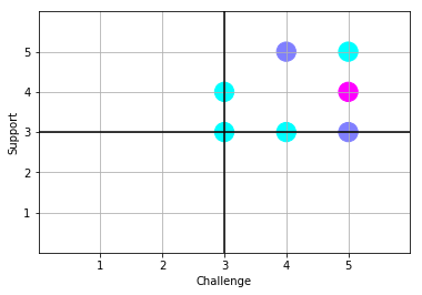
I make these visualizations with Python, using pandas and matplotlib — but you could just as easily use just a spreadsheet or, if your class is small enough, hand-plot the data on a piece of paper or a whiteboard. Here's what I got from my students (n = 11) from this past week. First, the challenge/support matrix:
The plot is set up so that individual responses are circles, and the "hotter" the color, the more frequent the response. Here, the light blue is 1 response (like the challenge = 3, support = 3) and the bright purple (challenge = 5, support = 4) happened 3 times. (The other purple is 2 times. I'm not a fan of this particular color map.) What this tells me at a glance is that students are mostly experiencing the right kind of balance of challenge and support in the course — there are no respondents who are coddled, disengaged, or stressed. If there were, I could reach out to them directly (these aren't anonymous, although you could make them so if you wanted) and see what's up. But at a glance there are no worries on this front.
Here's the competence/relatedness matrix:
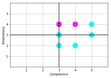
This time what I see is that there are a couple of students who, while feeling a sense of growing competence on the course material, feel disconnected somewhat from their classmates. Generally speaking most students are in quadrant I or on the boundaries, meaning that they are at least at a "controlled" state of motivation, which I will accept as a good result; but there's room for improvement and I need to talk with those two students in the lower half-plane (which by itself might improve their sense of relatedness) because their motivation is possibly at risk here.
Are the students who are in the "controlled" state of motivation actually at a higher level, in the "autonomous" state? That's where the autonomy plot comes in:
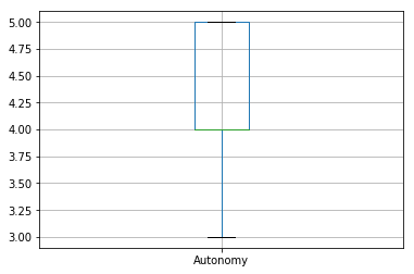
It's kind of hard to see, but the green line for the median is at 4.00, at the same place as the 25th percentile. So this is saying that 75% of the class rates themselves at a 4 or 5 on a scale of 5 on autonomy. At a glance, this is a good sign that students feel in charge of their own learning and not at the mercy of others.
Those three plots, which I can re-run at the click of a button next week once I have a new set of data, give me a kind of dashboard for taking the temperature of my class and real data with which to make decisions about what to do in following weeks. And I can keep asking this week after week — it's a short enough assignment that students aren't put off by it but informative enough that I can do something with the results. Because these are quantitative data, I can set concrete goals for my teaching (e.g. have every student in quadrant I of the challenge/support matrix from week 6 onward, or have a median of 4 on each metric, etc.) and measure my progress toward that goal.
This definitely isn't a perfect set of measures. For example I would need to do more analysis to see if the students who rated themselves low on autonomy are the same who rated themselves low on relatedness. Or maybe some students who have high self-ratings on relatedness have correspondingly low ratings on autonomy because they are so connected with others that they're not developing their own skills enough. Also these are self-reported ratings, and they have all the validity issues that self-reporting brings. And so on.
But as a simple, repeatable, lightweight instrument that generates informative data visualizations of what's important to me as a teacher, I'm pretty happy with these.
The code for generating all these reports is below (try not to laugh at my Python, please). Leave your own thoughts and suggestions in the comments.